Nov
09
2013
Today I saw something I never thought I would see: we watched salmon spawning in Vancouver. This has been all over the news and we went down to Still creek expecting to brave the crowds at 11am on a Saturday and no one was there except us and one guy with his kid! We watched for 3/4 of an hour. At one point, a dozen salmon were in view. I took pictures and a video. It was really cool!
http://www.flickr.com/photos/phall715/10771490015/
Sep
02
2013
I’m a bit claustrophobic so you would think that I would want to flee underground trainstations as soon as I arrive  but, actually, I love the idea of huge underground tunnels and stations and compared to our puny stations in Vancouver, it all makes me jealous even if it is mostly likely that they have to spend all this effort because Manhattan is, essentially, already full.
Jun
21
2013
This is so incredibly cool. It’s been all over twitter but just in case anyone didn’t see it, look at this:
http://www.theatlanticcities.com/jobs-and-economy/2013/06/map-iphone-users-any-city-and-you-know-where-rich-live/5961/
Jul
28
2012
I just spent a week in Paris; my 3rd time here although the last time was 19 years ago and the time before that was 32 years ago(!). I always find it surprising that despite the crowds and noise and intensity and heat, I love it this place. There’s something about the practical no nonsense, but respectful, way that Parisiens deal with visitors. That’s a bonus on top of the art and artifacts and history.
I’m always surprised by how much French cultural history relates to us in Canada even though we are nominally descended from the British cultural and political tradition. I wonder if it’s just that in their founding of a liberal democracy back in the 18th century (and again on the 19th century) they developed so many of the principles of democratic citizenry that are our received-truths about democracy, that when I am visiting some of their historical sites I feel like I am drinking in some kind of “eau de source” of democratic culture.
Of course, it doesn’t hurt that the bridges and the river and the trains and the bikes and motorscooters are also all part of what I imagine is the proto-city that Vancouver should aspire to. But that’s another story.
Aug
10
2011
I finally went to San Francisco. Wow. It’s a cool place. Even only being there for less than four days, I can see that this is a very cool unusual city. Of course, my experience there is far from ordinary.
I stayed in a really nice hotel for a bargain price (courtesy of friends and their hotel-points-plan). We had “happy hour: at a cool bistro and then really nice dinner at a nice restaurant followed by late-night drinks in a dark little bar. The next night, cocktails at a very quiet, dark bar, really nice dinner at a Really nice restaurant. What did we do the night after that? Why, cocktails at a fancy tourist bar followed by a not-quite-so-expensive dinner at a french cafe. That bargain price at the hotel? Well, I guess we spent the savings on food and drink.
Don’t get me wrong, we did lots of walking, sightseeing, and shopping during the (daylight) hours in between but next time I go to San Francisco, I might just have to go a bit further afield.
Jul
18
2011
I guess, if there was still any lingering doubt, this is enough to convince me that regular urban cycling is going full-on mainstream in this part of the world. Nothing new here in this article, by the way, the interesting to see it in the Globe, nonetheless.
Jul
11
2011
Just had to link to this: Frances Bula’s interesting take on car free precincts in the Italian tourist towns (along with the usual interesting-but-all-over-the-map discussion that her site engenders (and much of which I haven’t yet read).
Jun
28
2011
 |
|
 |
|
| Photo by Anne Katrine Harders |
|
|
|
I’m going to have trouble properly describing riding in Berlin. Berlin is extremely cool and Berlin bike riders are numerous and of every description. I rode from my hotel on the edge of Kreutzbeg as far south as Freie Universitie Berlin in Dahlem in the southwest and up to Prenzlauer Berg in the northeast: a big chunk of this territory I rode with Hal Loewen. We went fast and tried to learn from the locals. We also learned that motor traffic, while it’s heavy and runs at close quarters, is not threatening. Motorists seem accustomed to operating with bicycles among them and they always leave enough room and yield to bikes when crossing bike lanes.
They have lots of separated bikelanes here but it’s a bit of a trick. Berlin was built with many boulevards with wide sidewalks. To a great extent the bikelanes are simply a 1 metre portion of this sidewalk. This puts bikes into a conflict with pedestrians while leaving cars unimpeded. Well, sometimes it does. Where there are no wide sidewalks available they will certainly paint bike lanes on roads and re-stripe the traffic lanes to accomodate them. In many places, the painted bike lanes turn into separated bikelanes at intersections and there are many cyclist-specific traffic lights. At any rate, it all works to some degree or other. It’s nowhere near as completely thought-out as Copenhagen and our friend Rasmus reminded us regularly that Berlin hadn’t really figured it out yet.
They do, however, have a nifty bike-route finder.
What can we learn from this in Vancouver? I’m not sure I know enough history about the development of riding in Berlin. I don’t know if they, essentially started from a clean slate after the wall came down, for example. However, a dense route network is certainly part of the solution. Berlin, while being extensively built up, is not a compact city and not necessarily a dense city but their cycle route network is quite densely laid out, which means that you don’t usually have to go far from any given location to get onto a route. This is a lesson to offer Vancouver. Another lesson might be that we also have a few grand bouevards. Why, for example, is there no separate bike lane on Pacific Blvd? That street ROW must be 100 ft. wide.
We have a lot of work to do but it’s good to see a large city like Berlin with cycling development and features that we can work towards. One of the problems of constantly using Copenhagen as the ideal cycling city is that it’s development is so far ahead of ours, it’s not easy to always see what steps we should take next. With Berlin, the differences are easier to bridge: with more cycling routes to densify the network and with more separated bikelanes wherever we have right-of-way width, we can start to close the gap.
Jun
14
2011
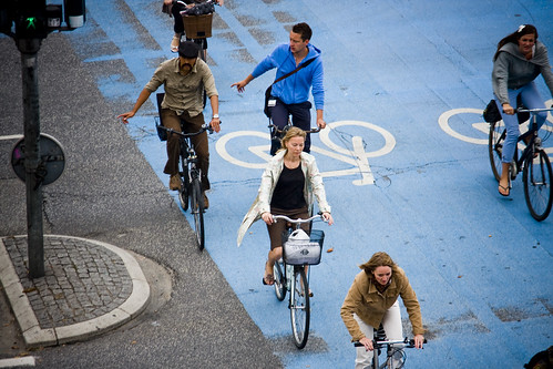
Photo by Mikael Colville-Andersen
I’ve been on an amazing adventure over the past couple weeks. During that time I went CYCLING in COPENHAGEN!! It was outrageously cool. I blogged about it over at Philiphall.ca but now it’s time to bring the cycling posts back here. More to come about cycling in Berlin. Yes, BERLIN TOO!!
Dec
25
2010
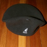
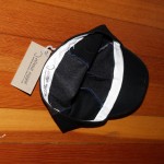
So I got two hats for Christmas. One is made by Kangol and one is made by Cima Coppi. As I started taking off the tags I was struck buy all subtle differences in packaging and brand-differentiation and how these two companies communicate to their customers through the tags and labels they put on their hats.
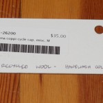
The Cima Coppi hat says nothing on the outside. On the hat band, as you can see in the picture: a simple stamp that has a logo and says: “cima coppi HandMade in Vancouver Canada”. There’s a tag attached that says exactly the same thing (I’m assuming it’s the same stamp) with the size M handwritten on it. I’ve also shown a picture of the reverse of the tag where you can see, in addition to the retailer’s price tag, another handwritten note: “100% recycled wool – handwash cold”.
Compare this to the Kangol cap:
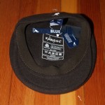
The Kangol hat has a catchy Kangaroo logo that’s embroidered into the back of the hat and printed on most the labels and tags. It has a large lable printed onto the inside (you can see it in the picture). That label states that it’s “100% pure new wool in three languages and gives washing instructions and says “Designed in Britain”. Another label at the back of the band gives the size, model number (I assume), origin (China), size, and a few other details. A second label at the back says “Kangol Founded 38.83 Blue”. I think Blue is the model name of this cap.
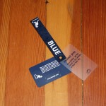
It has a set of three removable tags. One is clear plastic describing, sort of, the origin of the company: “Founded 38.83Â – Born British ’38 but raised on the streets of New York ’83”. A second tag is a ribbon with the Kangol logo and “Blue”. The third tag says: “Blue is unwaveringly true to the original ethos of the Kangol brand. Quality, value and unquestionably good product. No matter how the world changes these values won’t.” I have to admit, when I see little statements like this, I imagine the marketing consultants and company executives sitting around a sleek board room with large corplast boards on easels gazing at mockups and talking about the deep psychological buttons they’re trying to push and I wonder, don’t they realize that the more resources they pour into this kind of thing and more slick and “retro” they make it look and sound, the harder it is for them to overcome the powerful discrepancies between their labelling and Cima Coppi’s and what that says to me about the overall quality and authenticity?
Not that I’m complaining, mind you. They’re both nice hats and generous gifts.